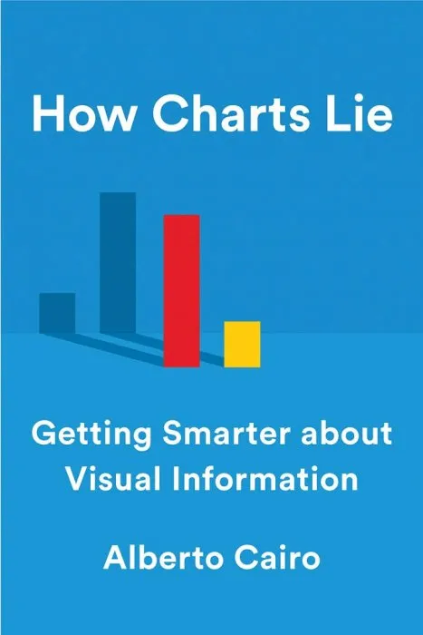
How Charts Lie: Getting Smarter about Visual Information

Date: October 15th, 2019
ISBN: 1324001569
Language: English
Number of pages: 256 pages
Format: EPUB
Add favorites
A leading data visualization expert explores the negative—and positive—influences that charts have on our perception of truth.
We've all heard that a picture is worth a thousand words, but what if we don't understand what we're looking at? Social media has made charts, infographics, and diagrams ubiquitous—and easier to share than ever. We associate charts with science and reason; the flashy visuals are both appealing and persuasive. Pie charts, maps, bar and line graphs, and scatter plots (to name a few) can better inform us, revealing patterns and trends hidden behind the numbers we encounter in our lives. In short, good charts make us smarter—if we know how to read them.
However, they can also lead us astray. Charts lie in a variety of ways—displaying incomplete or inaccurate data, suggesting misleading patterns, and concealing uncertainty—or are frequently misunderstood, such as the confusing cone of uncertainty maps shown on TV every hurricane season. To make matters worse, many of us are ill-equipped to interpret the visuals that politicians, journalists, advertisers, and even our employers present each day, enabling bad actors to easily manipulate them to promote their own agendas.
In How Charts Lie, data visualization expert Alberto Cairo teaches us to not only spot the lies in deceptive visuals, but also to take advantage of good ones to understand complex stories. Public conversations are increasingly propelled by numbers, and to make sense of them we must be able to decode and use visual information. By examining contemporary examples ranging from election-result infographics to global GDP maps and box-office record charts, How Charts Lie demystifies an essential new literacy, one that will make us better equipped to navigate our data-driven world.
Download How Charts Lie: Getting Smarter about Visual Information
Similar books
Information
Users of Guests are not allowed to comment this publication.
Users of Guests are not allowed to comment this publication.


